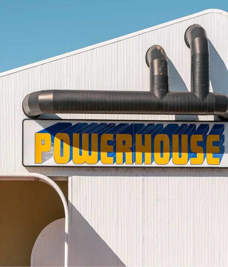
Although I haven’t pulled the camera out a great deal this year, an impromptu trip to Queensland with my daughter offered up the opportunity to hit the road. Over three days we drove from the Gold Coast to Toowoomba, cutting across to Kingaroy and back via the coast. While I wasn’t expecting much in the way of images, I was happy with a few and thought it might be nice to talk a little about composition.
I love this image because it sums up Queensland so perfectly. You have the big, blue sky, the same green of the bush and hinterland, and the yellow of the beaches/lifesavers, with a cheeky nod to the more adult activities on the Gold Coast and, of course, Queensland’s fave beer (highly debatable).
As you can see above, I rarely take just one composition of a scene, usually aiming for at least a horizontal and vertical. It can take a while to find the right composition. I’ll often be torn between which to upload to the website, but I think here the landscape orientation works a little better.
My daughter is starting to get into photography, so it’s wonderful to be able to shoot with her and talk the talk, so to speak. She’s becoming quite a good photographer in her own right. We took a few photos around Toowoomba. Having near been there before, I was surprised by the size of the town but also at the beauty of the architecture, especially the famous Empire Theatre.
The Empire Theatre, Toowoomba. Here I was drawn to the shadows at the front of the theatre and particularly liked the way the light was creeping up the bollard at the front. And hey, what’s a theatre without a bit of mystery?
And here is a quite different composition shown in the a window reflection showing a mirror image of the theatre and signage across the street. As always, it’s putting these elements together in a compositionally pleasing way that is the challenge.
Above you can see how I was drawn to these three buildings each built in a different time period. On the right is what I’m thinking in my head putting together the composition in my head, which is for all intents and purposes the rule of thirds. What’s interesting is how it’s not symmetrical. I believe this is because I wanted more highlights on the left to balance the darker tones of the right.
Right next door to the Empire Theatre is the equally beautiful Masonic Hall - a common fixture of most regional towns.
From Toowoomba we headed to Crows Nest, a popular stop given the now famous patisserie, which was sadly closed when we arrived. I did manage to score a variety of rather interesting flavours of soda at the Crows Nest soda shop (musk, anyone?), also taking a moment to check out the local art collective.
It’s a fairly nondescript drive following this to get to Kingaroy, a regional town largely famous for its peanut production. Naturally, we couldn’t resist stopping by the peanut van in town for some salted caramel peanuts, though they have bacon and a ton of other unusual flavours if that’s more your vibe.
I had fallen in love with this parking lot for the town cinema at Kingaroy on Google Maps. Blue skies and the right lighting made it perfect. There’s just something so wonderfully retro about it.
But again, which composition works best? I suppose when I’m composing in camera, I’m always imagining these images printed large and hanging on someone’s wall, which is where I think all the negative space comes into it.
Right in the middle of town are the peanut silos and factory. There’s a golden tower there of some description. I have no idea of its actual function, but I loved the look of it. Even with the right light, however, I could not find a composition that worked, as you can see below (the best I could muster). And sometimes that’s simply the way it goes.
Peanut production, Kingaroy.
Above is another scene I found walking around town. I’m constantly drawn to bright colours and scenes I think sum up towns in a way. Which composition of the three do you prefer?
Or how about this town bakery? Is the composition better with or without the classic green canopy on the right?
How about the scene above? And yes, I know it’s more retro signage, but I cannot resist. To me, while the image on the right has a more simplified geometric feel to it, there’s more compositional complexity on the image on the left thanks to the mirroring shadow at the bottom of the frame. I also think the addition of the tree in the top left is interesting.
Of course, everyone sees things differently, and it’s been fun seeing what my daughter has been able to come up with viewing the same places. There is something about a child’s eyes that is imbued with a natural curiosity and willingness to explore composition that is perhaps lost the older we get and the more visual stimulus we’ve churned through in life.
As for the trip, if you live in Queensland I’d highly suggest hitting the road and exploring some of these regional towns if only to escape the hustle and bustle of the big cities (and that god-awful M1). Thanks for viewing.


